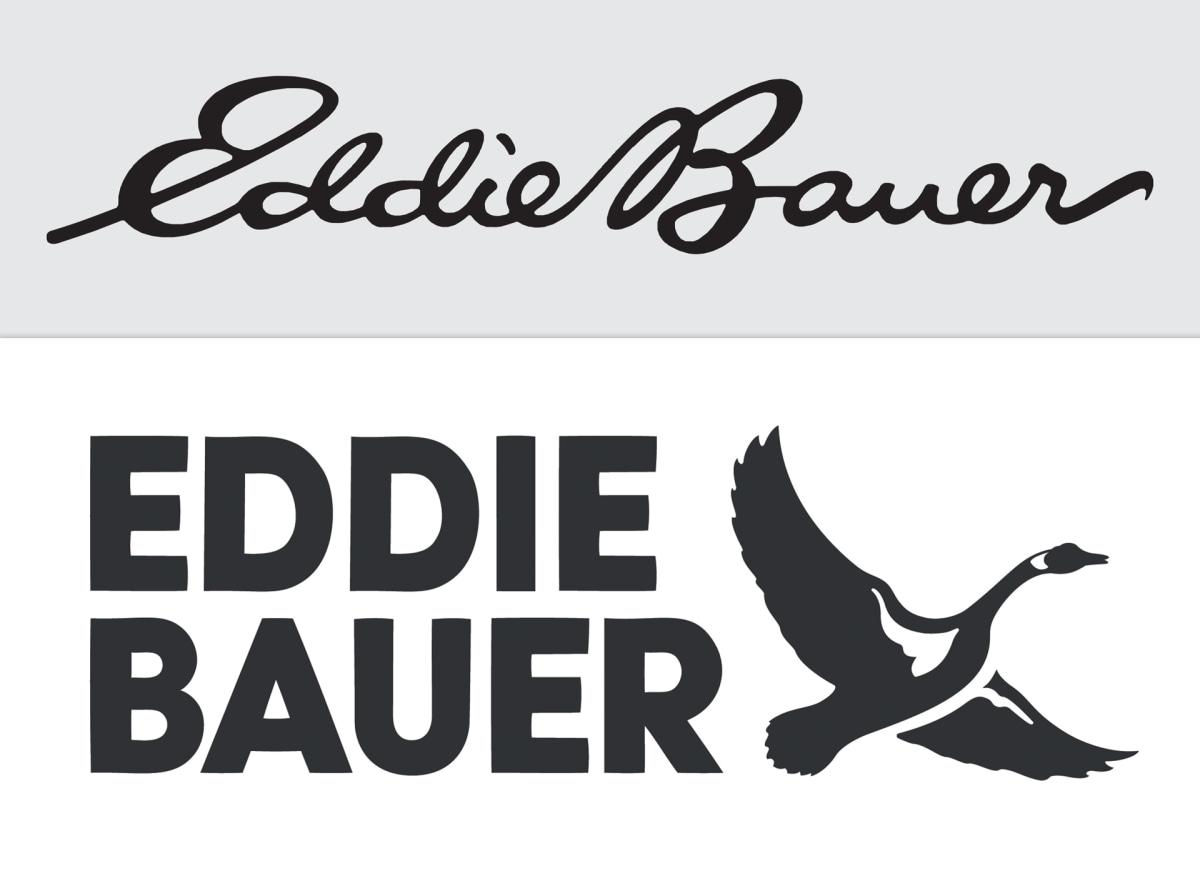
Fast Company - After 59 years, outdoor outfitter Eddie Bauer is trading its cursive logo for something a bit more tangible: a goose.

But not just a goose. The bird is accompanied by a simplified version of the brand name, now written in all-caps block lettering. On the full stack logo, additional details include the company’s date of establishment (1920) and the phrase outdoor outfitters. It’s a major rebrand that launches on Eddie Bauer’s digital platforms today and will start to appear at international brick-and-mortars on a rolling basis. By fall 2024, all Eddie Bauer products will begin to feature the updated logo....
Though [the] team initially toyed with the idea of keeping the
script font, the general reaction they received was that it looked dated
and, to some, confusing. “A big part of what I’m going to need to do
here is reintroduce this great heritage brand to the next generation,”
Bantle says. “And kids don’t even learn to read cursive in school
anymore.”
1 comment:
EDDIE BAUER / Eddie Bauer
This company appears to have problems, and they simply don’t know what to do about it.
People, even youth… or especially youth, have a way of finding what they want. Hide it, and they will ferret it out, despite your deceptions. Misspell a word as many organizations find enjoyment in doing, and customers actually will see humor, or consider it avant-garde, even rebellious. Cool!
This Company needs better brains.
Post a Comment